

Usage
Colour schemes
Section titled “Colour schemes”Website > Themes > Canvas > choose a scheme. Every scheme is a normal CS-Cart style: open it in the Theme Editor to change colours or fonts; your copy keeps working after theme updates.
The tile board
Section titled “The tile board”A tile board is a normal Block Manager grid with the user class kv-canvas. Every block inside it is a tile.
- Open Design → Layouts → Homepage (the three Canvas layouts already have a board).
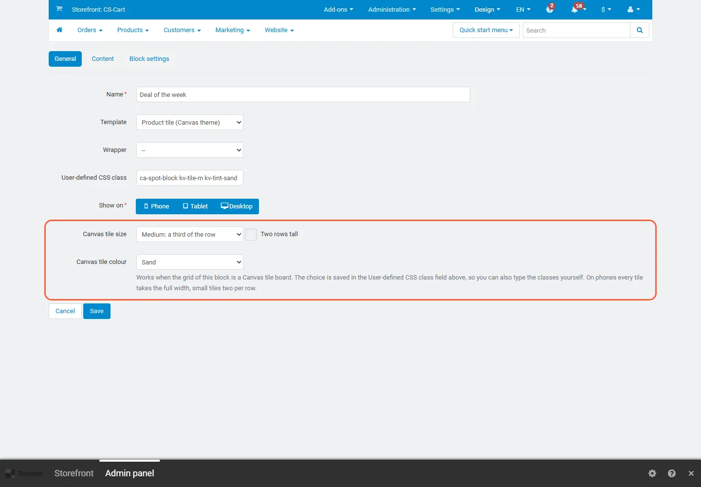
- Click the gear icon of a block. In the General tab pick:
- Canvas tile size: Small (a quarter of the row), Medium (a third), Large (half), Extra large (two thirds), Wide (the whole row) or Full row (no tile). Tick Two rows tall to let the tile span two rows next to two stacked tiles.
- Canvas tile colour: Paper (default), Sand, Mist, Sage, Ink (dark), Accent colour or Clear (no tile background, for blocks that bring their own, like the hero or the deal band).
- Save. The choice is written into the block’s User-defined CSS class field, so you can also type the classes yourself.
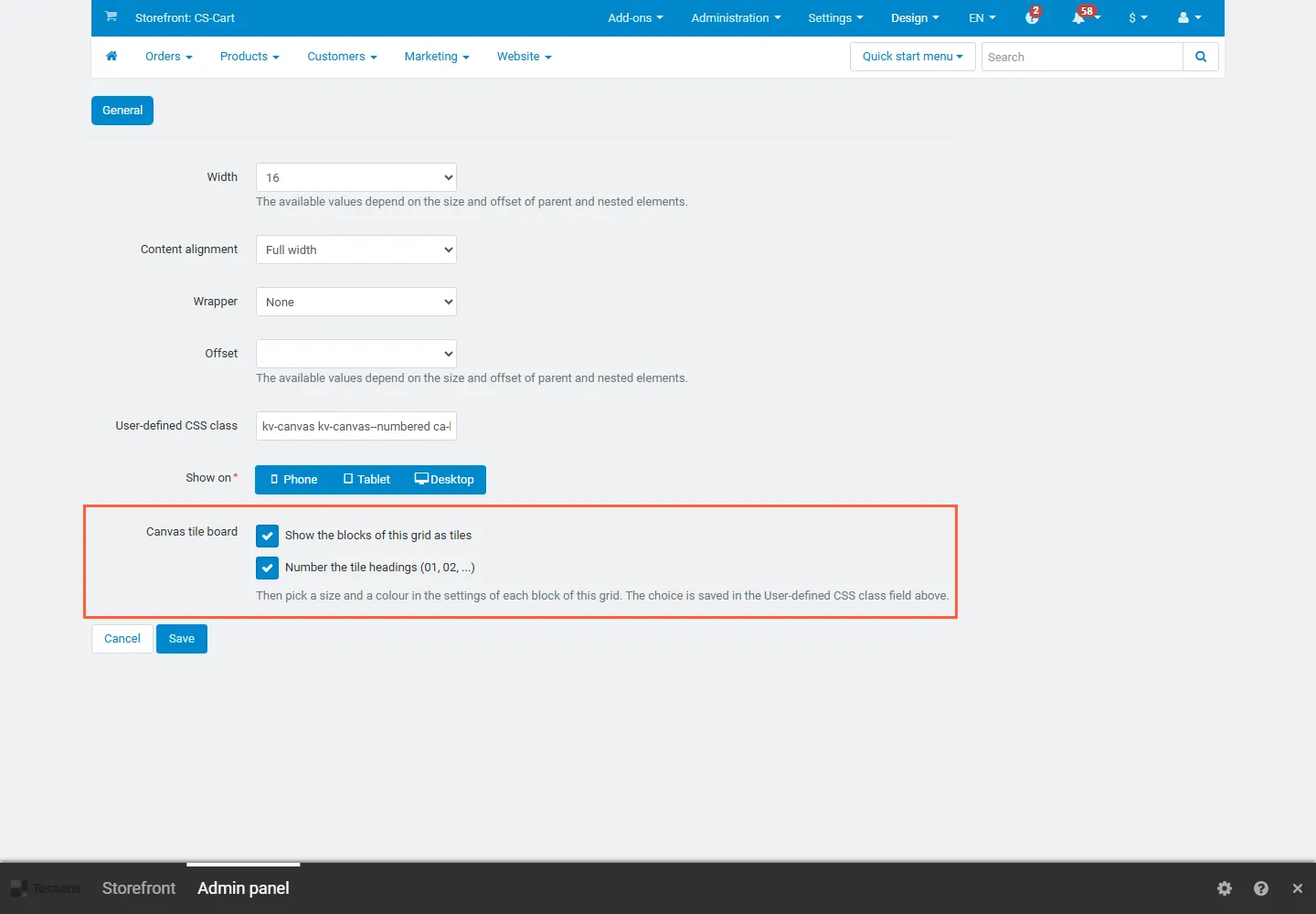
To make another grid a board (on any page), click the grid’s gear icon and tick Canvas tile board (and, if you like, Number the tile headings). The board fills each row from left to right; on desktops a later small tile may move up into a gap.
| Screen | Columns | Small | Medium | Large | Extra large | Wide |
|---|---|---|---|---|---|---|
| Desktop (1024 px and up) | 12 | 3 | 4 | 6 | 8 | 12 |
| Tablet (768 to 1023 px) | 6 | 3 | 6 | 6 | 6 | 6 |
| Phone | 2 | 1 | 2 | 2 | 2 | 2 |
“Two rows tall” only applies on desktops. On tablets and phones the tiles follow the order of the blocks in the grid exactly: put the most important tile first. The board must be a full-width grid without a grid wrapper, with the blocks directly inside it (no nested grids).
Classes (for the “User-defined CSS class” field)
Section titled “Classes (for the “User-defined CSS class” field)”| Class | Effect |
|---|---|
kv-canvas (grid) |
the grid is a tile board |
kv-canvas--numbered (grid) |
tile headings get a number chip (01, 02 …) |
kv-tile-s, kv-tile-m, kv-tile-l, kv-tile-xl, kv-tile-wide |
tile size |
kv-tile-tall |
two rows tall (desktop) |
kv-tint-sand, kv-tint-mist, kv-tint-sage, kv-tint-ink, kv-tint-accent, kv-tint-clear |
tile colour (no class = paper) |
The device classes of the Block Manager (“Show on” desktop / tablet / phone) work together with the tile classes.
Tile recipes
Section titled “Tile recipes”Copy these block setups; sizes are for one desktop row of 12 columns.
| Recipe | Blocks (size, colour) |
|---|---|
| Hero row | HTML or banner block with your hero (Extra large, Clear) + Product tile (Canvas theme) on “On sale” (Medium, Sand) |
| Promise row | four HTML blocks with one number each, e.g. $49 free delivery, 30 days returns (Small; Paper, Mist, Sage, Ink) |
| Department directory | Count tiles (Canvas theme) on “Full tree”, 4 per row (Wide) |
| Two product rows side by side | Products block “Bestsellers”, Grid, 3 columns, 3 items (Large, Mist) + “Newest” (Large, Sage) |
| Deal corner | HTML deal text (Medium, Two rows tall, Clear) + Products “On sale”, Grid, 4 columns (Extra large, Sand) + a help or text block (Extra large) |
| Brand + journal | HTML brands (Medium, Mist) + Blog “Recent posts” (Extra large) |
| Newsletter and about | HTML about text (Large, Sage) + newsletter card (Large, Clear) |
| Vendor spotlight (Multi-Vendor) | Vendors block (Large, Sand) + Products from one vendor (Large) |
Tips: use Ink and Accent for HTML, stat and product tiles (their text and links are recoloured); keep product grids, vendor and menu blocks on the light colours. Keep the sizes of one row adding up to 12 (3 + 3 + 3 + 3, 4 + 8, 6 + 6, 4 + 4 + 4); use Clear for blocks with their own coloured background; product grids inside Large tiles look best with 3 columns, inside Extra large with 4.
Home layouts
Section titled “Home layouts”The theme installs three layouts. Open Design > Layouts and set the one you want as default:
| Layout | For | Home page |
|---|---|---|
| Main (Canvas) | most stores | hero + product tile, four stat tiles, count tiles, bestsellers + newest side by side, deal corner, help desk, brands, journal, about and newsletter, numbered tile headings |
| Mosaic home | stores with strong imagery | full-width hero, offers grid + product tile, category image tiles, trending row, promos + deals, stat tiles, brands, newsletter |
| Index home | large catalogues and marketplaces | no hero: count tiles (6 per row) first, stat tiles, new arrivals, top sellers + deal band, most popular, help desk and about |
Preview a layout before switching: Design > Layouts > the layout > Preview.
Category and product pages
Section titled “Category and product pages”The category page shows a Category promo tile inside the product grid after the fifth product (block “Category promo tile” at the bottom of the category layout: edit its text and link, or switch it off) and a short buying guide. Product pages get delivery facts and related products under the main content. Product deal timers appear when a product has an active catalog promotion with an end date (Marketing > Promotions).
Phones
Section titled “Phones”Below 768 px the header becomes compact, a bottom bar shows Home, Menu, Search, Account and Cart, filters open in a sheet, and product pages get a sticky buy bar. The tile board becomes two columns.